Sunday morning
12.15.2013
When I was in my formative photography years, I was astounded when I first experienced prints from large format film, either B&W or color. The imagery within the paper was solid, optically precise, and had a physical presence that suddenly brought the imagery alive in a deeper way, elevating the print itself into something uniquely remarkable. My first exposure to large format color, Stephen Shore and Joel Meyerowitz, was similarly revelatory. Awareness of possibilities expanded when I saw platinum prints, and was overwhelmed by the visceral opaque presence and luminosity possible from otherwise unremarkable grays. Then I saw an exhibit of Ansel Adams prints with Richard Avedon prints, the expected experienced in the Adams, but the Avedons, overly enlarged, close cropped, harsh contrast and grainy, portraits of celebs. Spending some time with them, they also have their unique qualities as objects, conveying images, affectively in different ways. Then, Ralph Gibson, totally different from the large format work. Strong contrast, hard sharp beautiful grain, bright whites, a brilliant crystalline universe of human experience.
It’s easy to dismiss the potential qualities of the object as mere craft, but the fact is, this is what conveys the image, this is it’s conduit from one human to another. These qualities are literally the alphabet telling the story. That there are many ways to utilize it, some we have more affinity for than others, enhances the possibilities. I’ve experienced odd biases amongst practitioners, some large format silver workers remain closed to the experience of prints that don’t utilize those particular standards, or the reverse, an immediate dismissal of any artist who choses to represent their imagery with highly refined craft.
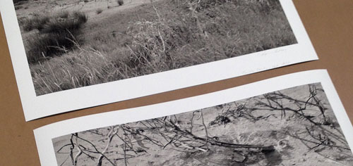
As a printer I’m regularly reminded that because we can do large prints more easily than ever, doesn’t mean we should. Much of my work is large format B&W landscape, in my opinion best communicated by optical clarity of the image rather than underlying structure like grain, and as subtle, luminous, and opaque presence of the tonality I can muster. Therefore I am only willing to enlarge to a point, too much and those qualities fall apart, that’s it. Sure I could make a larger one to match the width of your couch, but it’s no longer my work. There is plenty of imagery whose effectiveness does NOT depend on these criteria, nor do these qualities meet with the intent of many artists. There is no judgement here, if we close down and limit our expectations, we limit our potential experiences in art, and our possibilities as artists. I have plenty of other work that utilizes different criteria I find effective, cell phone imagery for example.
This is directed at the representation of still imagery, obviously film, animation, etc., is not communicated as an object in this way. Still photography, more and more, is communicated electronically, and it’s possible to imagine someone committing to elevating the representation of imagery as displayed on the monitor. This has it’s own alphabet that, once thoroughly understood, can effect decisions about what imagery is best, how it’s best prepared, etc., just as the decisions we make about prints. No doubt this is happening now, just as many artists exploited the unique qualities of video to communicate their work.
Art communicates something, from one to another via some conduit. There is no transparent conduit, each has it’s characteristics, some more or less ideal than others for a given experience, some uniquely compelling when mastered, some simply have no remarkable characteristics. Investigating those options and mastering that alphabet enhances the possibilities to communicate, ignoring or using them badly limits the experience.
Dramatic evolution of culture, art, media, etc. opens possibilities hard to imagine, potential virtual experiences created by artist and others, the mind boggles. But not participating is not being left behind, it’s choosing to commit to an alphabet beautifully refined for decades or centuries by remarkable artists. My work is best and most effectively realized in the form of my particular kind of print, no electronic media is yet suited to get the particular qualities across I wish to explore. This is no judgement, it could change, or I could do a different kind of work that does exploit new media.
But the fact is, I’d rather hear Bach’s Suite No. 3 in D major played by an orchestra on centuries old Stradivarius than some garage band plugins.
But hey, you got something to lay on me, I’m open!


Leave a Reply