Inkjet printing on uncoated papers
06.13.2020
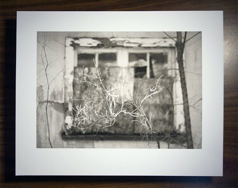
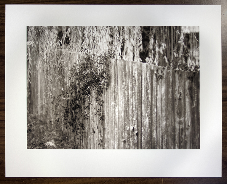
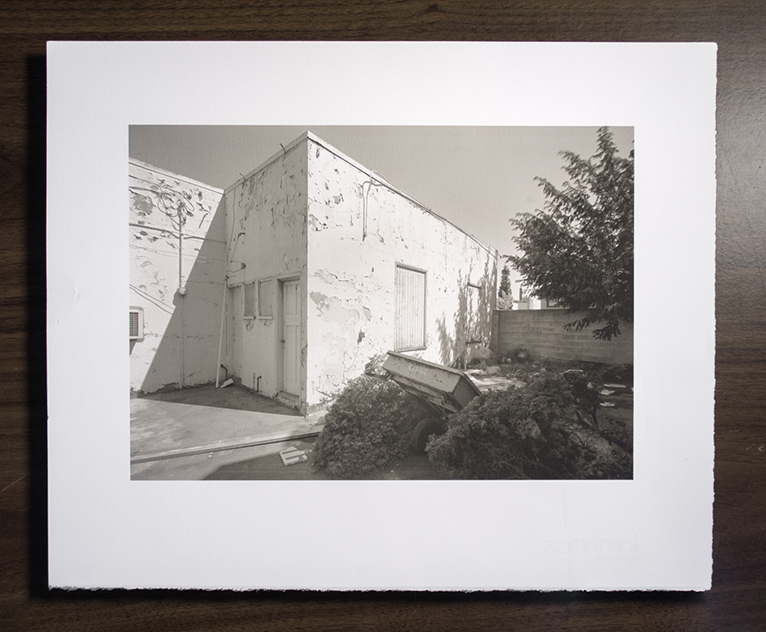
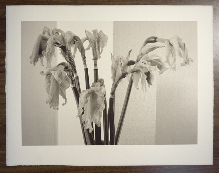
During the first couple of months of the covid-19 lock down I did some work specifically to be a small part of the artists all over the world sharing their creative efforts to stay engaged. Not to sell as lock down art, just to be a part of the coping mechanism for our new world.. hey I’m doin this, wadaya think, what are you doin? Presented on social media, it was a series of one off prints of images I liked, but that otherwise may not fit into a portfolio or edition. Consistent with that I used whatever unusual materials I could turn up here, and it turned into an exercise in printing on uncoated fine art papers not generally suited for inkjet, but nonetheless beautiful.
For those who may be interested here is a summary of those efforts and some of the technical issues involved with this kind of printing. Without a coating designed for inkjet, these papers tend to have a lower dmax, a more muted palette, and need ink load limiting or they will mottle and wick into the paper and not hold a sharp photographic image. They also need linearization due to high dot gain,
For reference, a few years back we were generally getting dmax in the range of 1.6 – 1.7 on premium coated matte papers with pigment matte black inks, on uncoated papers much lower. Contemporary matte black inks from Epson, HP, Canon, and Cone (in particular) yield black on some papers now exceeding 1.8. So blacks on uncoated papers with these new inks have crept into the previous range of coated papers.
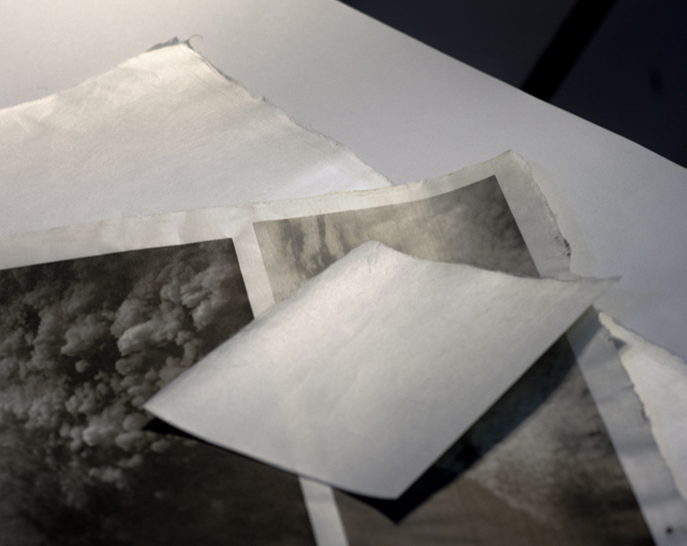
With the exception of a few Aches examples, these are all black and white prints, made with Piezography inks, using the Ergosoft StudioPrint rip, so my setups will not relevant to all but a few, but the technical challenges remain the same for any setup, and I’ll see if I can advise more generally, including for color. First of all a summary of the prints and papers used.
The first one was on Hahnemuhle Bamboo, a well known paper made and coated for inkjet, with widely available profiles, and no unusual approach worth describing here. And it’s not a traditional fine art paper like the others. The links to the initial instagram write ups are included for more info on individual papers. My apologies for the quick and inconsistent print copy work.
The second was on Crane Lettra, a letterpress paper.
© Tyler Boley
© Tyler Boley
A dmax of 1.6 was achieved with this paper. The instagram write-ups are here-
https://www.instagram.com/p/B-Q-38GAoV4/
https://www.instagram.com/p/CA5axqen-v0/
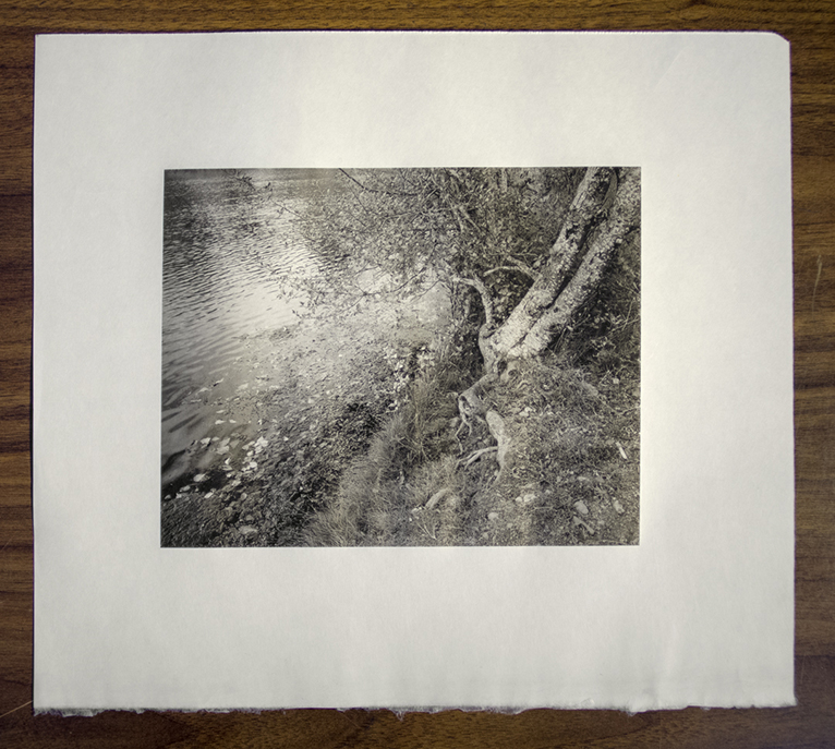
next, Somerset Velvet Radiant White.
© Tyler Boley
The first paper extensively used for photographic ink printing, along with Arches Watercolor Paper. The vast majority of Iris fine art prints were made on it. The initial Piezography products were designed for it as well, and much of our early inkjet experimentation was done on it. There were no fine art papers coated for inkjet back then. As great coated papers came along I and most others left Somerset Velvet Radiant White for the newly achievable densities and gamuts. This exercise reminded me of how beautiful the paper is, I just got more to get back into it. The setup yielded a dmax of 1.57
The instagram write-up-
https://www.instagram.com/p/B-tm6LWAWT1/
third, Magnani Revere Ivory Felt, achieved 1.6 dmax
© Tyler Boley

© Tyler Boley
https://www.instagram.com/p/B-zjI9BAAvw/
then, Magnani Revere Bisque Suede, ink setup 1.5 dmax
© Tyler Boley
© Tyler Boley
The instagram write-up-
https://www.instagram.com/p/B-4ufW5AbU7/
next, Rives BFK , 1.5 dmax
© Tyler Boley
© Tyler Boley
The instagram write-ups-
https://www.instagram.com/p/B_ST5BqJw-M/
https://www.instagram.com/p/CBI8QPjnDXK/
Magnani Revere Ivory Suede, slightly less toothy paper than Ivory Felt
© Tyler Boley
https://www.instagram.com/p/B_arcZRgsMD/
seventh, Arches Cover 1.5
© Tyler Boley
The instagram write-up-
https://www.instagram.com/p/B_m-weVA3Cs/
then, Arches Watercolor, another paper initially used for the earliest Iris printing, this is. Cold Press, achieved 1.6 dmax
© Tyler Boley

© Tyler Boley
The instagram write-ups-
https://www.instagram.com/p/B_3FDwTA3yo/
next, Kraft paper! Tests yielded dmax up to and over 1.7. But it’s important to know the ink is on a substrate that is already dark, so the range from dmin to dmax is probably more conventional, and I did have to limit the ink at a point below dmax to avoid mottle and bleed. But visually the blacks are surprisingly good.

© Tyler Boley
https://www.instagram.com/p/CAT57rag0kn/
last, Shikibu Gampi , drop dead gorgeous paper. It was hard to linearize as the pearly surface or some other factor seemed to confuse my spectro. My old patch by patch EyeOne handled it better, and probably a polarized device would be optimal. Anyway, I got over 1.7, amazingly, but since measurements seemed difficult, we’ll just call it 1.7, or in better terms- great. It’s also very thin, but it moved through the LF Epson without problems, a front loading desktop printer might require a different technique, maybe a backing.
© Tyler Boley
© Tyler Boley
© Tyler Boley
The instagram write-ups-
https://www.instagram.com/p/CAbMHkgAJSa/
https://www.instagram.com/p/CAtD19gH6de/
More Magnani Revere examples-
https://www.instagram.com/p/B-94H35Aiy_/
More Arches examples-
https://www.instagram.com/p/B_sFYAEAzcm/
https://www.instagram.com/p/CALsWuLAb_z/
The software I use for printing is used by few so I won’t spent time getting deeply into that. With any setup, printing on non-standard media requires the ability to control the ink in some way. Briefly, the Ergosoft RIP allows one to select the dot size combination, and the limit, of each ink in a setup, and also to linearize tonal transitions from paper white to ink max, and limit the total. On uncoated papers that will mottle or bleed with too much ink, not only the highest densities of black and other colors need limiting, but middle and light colors may be made combining a number of inks or high loads of light inks, so even light and middle values may bleed or mottle without control. Also different inks required different treatment for the most optimal setups. For example, printing color on Arches (there are some examples in the above Arches link) Epson Ultrachrome yellow required more limiting than other colors. To add to the limiting and linearization complications, an icc color profile then has to be made for that setup, in my case CMYK or CMYKOG.
I believe Imageprint users can request custom inksetups and profiles from them for non-standard papers, both B&W and color.
For Piezography, they may have profiles for their inks with unusual papers to use in Quadtone RIP available, and are certainly capable and willing to help their users with custom setups. They know as much or more than anyone on the planet about unique printing methods and exotic materials. Advanced users have all the tools and direction from Inkjet Mall necessary to optimize setups.
Quadtone RIP users, whether for use with OEM inks, or B&W inksets, are probably already familiar with the process. Run through the provided profiles, find one made for another paper with an eye out for mottle and bleed, and go from there, if you or someone you know can relinearize that existing profile on your exotic paper, perfect. For experienced QTR users making their own setups, you know what to do. QTR allows advanced control of the inks.
Next is for users with normal OEM provided printer drivers and normal OEM inks. This are my suppositions based on years of Epson, though I’ve lost familiarity over the last 10 years doing less and less color and OEM drivers. The media choices basically put down different amounts of ink. As with QTR normal users, you have to make a series of test prints (small is best, no need for waste), using different media settings. When I was more familiar with the OEM driver, the least amount of ink used was with the plain paper setting, in fact in my newbie days, I made prints on Arches Cover with that setting. In the driver, they used to be listed from lightest to heaviest ink delivery, not sure now. Look for a setting that doesn’t put down enough ink to mottle/bleed, but enough to not look too weak. Let your tests sit for a bit, wet ink in these papers looks worse than it will. Media testing applies to both the ABW driver and for color. Once the media setting is selected, for the ABW driver you are stuck with the lighter/darker/etc, setting to try to get the progression of tone to come close to expected monitor representation, and of course you have the hue control available. For color, once the paper setting is determined, you are left with more experimenting with the available profiles for some kind of color accuracy, or better, have a custom one made for that paper and setting. These papers with inkjet have a “look”, for color in particular, you have to like it and want it, rather than expecting conventional results. At the least it’s generally more muted and soft, I found it particularly suitable for cross processed color. If you find you can’t get the saturation or densities you prefer, change materials.
I’m drawn to these papers for a variety of reasons. the papers themselves have a definite aesthetic appeal, many are made by old world fine paper makers, some have been used for hundreds of years. Arches watercolor paper is largely still as it was made in the 1800s. Names like Arches, Crane, St. Cuthbert’s Mill (Somerset), Magnani, and of course the traditional Japanese papermakers represent the highest levels of craft over the centuries. The surfaces, hues, making, whether by hand, mould made, etc.. all have an undeniable finesse. The way they take ink is different, ink is not suspended in a coating on the surface, it goes into the paper. Of course this makes things technically difficult, but when properly addressed the results are still photographic. Many from the traditional photography print world, compare everything the the holy grail of gelatin silver. But the history of photography and fine printing includes photogravure, alternative hand coated processes like platinum, kallitype, cyanotype, salt, etc… many far more delicate in image presentation than ink on uncoated paper.
A less discussed issue, longevity. IMHO, the most vulnerable physical property in our beloved new inkjet prints is the coatings. First of all, they flake and scratch easily, prints have to be handled and stored extremely cautiously, far more so than we are used to in photography. I’ve had to discard many prints no matter how careful I’ve been. Secondly, they are highly hydroscopic and attract, and react to, chemicals from the environment. One of our biggest early problems was severe yellowing from outgassing adhesives in proximity to the prints. Something as benign, selected casually, as a print storage or portfolio box manufactured with certain common adhesives and tapes, may cause brilliant yellow stains in a short time. This is not paper yellowing we are used to, this is a chemical reaction in the coating. You can even bleach the stains back out with exposure to UV, if you chose to set your prints in the sun for a while. Much more is not yet known, or published, it’s a delicate subject the makers of these popular and expensive materials are not talking about much. It’s worth being wary of an issue with so many unknowns, if longevity is a major concern in your endeavours.
In my case, that my work endures as I intended beyond my lifetime is not a concern for me or anyone else. But given the choice, I’d prefer to make things that last, just as I was careful with my darkroom processes. The more subtle presentation of these papers suits my work, I”m often chided about avoiding blacks, and the muted grays of my prints, so even though I utilized it, that last point of dmax is down the list of priorities. My large format work tends to be very tactile so I need to retain sharpness, but the sensual presentation of soft tones on these subtle surfaces, if exploited properly, shows my imagery with a physical presence I prefer. I intend to continue to explore the possibilities these material combinations my yield for my own work. For now the majority is still on premium coated inkjet fine art papers.
High performance inkjet printers, great pigment inks with longevity and gamut, and a wide variety of media from glossy photo surfaces, to metal, to materials used for alternative process negatives, plates for gravure, and fine materials like these old world crafted papers places us in an era unprecedented for creating amazing prints of all kinds, objects of art.


This was extremely helpful, thank you for sharing your efforts
I’m glad you found it useful
Thank you, Tyler. I read this last year and then this year I decided to try some uncoated papers, in large part because of interest in using lighter-weight uncoated papers in handmade books.I am using papers with only a very subtle texture for a surface and under 150 gsm with Piezo Pro inks, and a basic uncoated paper curve (Cool, Warm, Neutral) that I mix into a warm neutral (for now). Any hints appreciated.
Hi, I find the biggest challenges are paper choice and ink setup. The only option for selecting appropriate papers is to get a bunch and try them since they are not made for this and there are no guidelines. The red flags are, so much mottle and/or bleed no reasonable amount of ink limiting is going the address it, and lack of attractive density on the paper, although a muted look for certain work can be attractive. Many alternative processes are quite muted. None of my tests have been with thin papers, other than very expensive Shikibu Gampi, so I can’t make any specific recommendations. I recall trying a Mulberry paper long ago that was workable as well. So Japanese papers may offer some great thin options.
The ink setup is the next issue. You are likely using QTR with the Cone inks, and I’m not familiar with customizing and tweaking their setups, though if you have been supplied a basic uncoated curves to work with, that’s a start. I use a different RIP. When I helped a friend set up Piezography Pro, I found an abundance of material from Inkjet Mall that came with the setup, I don’t know about tweaking their curves, I’d look for any info about limiting. You may find a paper you love but the curve needs a little tweaking, limits, or linearization. I don’t know what to add that may be applicable to your efforts, hope this helps some
thanks, Tyler. Helpful. I have been using Asuka 75 gsm, a Washi paper, it is quite nice for certain kinds of bookbindings — it is coated. I will keep experimenting with the basic uncpated paper curve until i find a paper that seems about right and then will engage in fine-tuning the curve.
Hello
Great article, thank you ! Any hint on a fixative to prevent black inks from smudging ?
hi, sorry I don’t have a suggestion, have not run into that particular problem. Not saying it doesn’t happen, probably more likely with highly sized papers like Arches. There are certainly fixatives for art, like the ones we used to use for charcoals. I’d just make sure they’re manufactured for longevity, on paper. Sorry don’t have more to offer on that.