About the Monteverde Cloud Forest prints
09.13.2013
Another older group of work, still have a lot of catching up to do, as well as adding new work. In 1990 we went to Costa Rica. It was just before it exploded as an eco tourist destination. Winding up into the mountains in a bus on a dirt and mud road, we arrived at the Monteverde Cloud Forest, at an elevation of 4662 ft. on the continental divide. Now quite popular, with several major hotels and tourist activities, it had not yet been very developed, even though a well visited spot. In fact, the developer of the “resort” yet to be started was staying in our lodge, suffering a meltdown with the difficulties of making things happen in such a small and removed community. I wont waste space here with what you can easily find with google, but after donning boots and rain gear and heading into the trail, you feel as though you’ve entered the lost world, a very real Eden, with an abundance of life everywhere. Monkeys in the trees, green and blooming things everywhere, exotic birds, insects.. it’s overwhelming. It did rain once a day or so, but the sun was also out quite a bit and it was warm. On the continental divide with Pacific and Atlantic air meeting overhead, weather changes rapidly. The first photograph I made is nearly identical with this one on the right, this incredible tree.
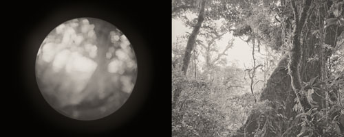
With no room, muddy and steep ground for tripod and boots, and in a state of amazement, I made an exposure, then and started to put my stuff away. Then, I was certain I had made many mistakes, just more into the moment than my work, and decided to expose again, this one on the left is the result, I forgot to pull the retractable lens of my Makina back out. I like it though, you can see the shape of the tree even more wide angle if you know it’s there, but actually it looks like a planet. It’s impossible not to be aware, in a heightened visceral way, of this life, and all life, on Earth, in this overwhelming place.
Fortunately, realizing my additional mistake, I pulled out the lens and was careful to make this exposure on the right, properly. Much of our time there I was pretty overwhelmed with the place, in the mornings outside the lodge near the exterior lights all kinds of bizarre and amazing insects would have gathered attracted to the lights. The variety of hummingbirds was huge, Toucans were in a tree outside our window one morning. It’s also hard to work in the forest, it’s dense, everything is two feet from your face, one inch to the left or right and your image completely changes. The scene brightness range is extreme, down in the forest beneath dense and huge trees, with bright sun landing in spots around you, and almost always a very bright sky up there between the branches. The lack of light down on the forest floor made for long exposures, always on a tripod, and so motion blur in all the delicate foliage was a given. The result is these nine images. It’s a dream of mine to go back this place, more prepared, maybe with my 5×7, for an extended stay with the primary purpose of making images.
Technical information- The work was made with a Plaubel Makina W67, on Ilford XP1 film. This film contributed to the results, it has a way of slowly shouldering off allowing exposure into the shadows while still retaining printable highlights. They never seem to block up. Still, on most of these I underestimated the required exposure for these deep shadows, and shadow detail is difficult to bring out. In the darkroom I resorted to higher grade papers for separation, then flashing and burning to get highlights back. One set of silver prints was donated to the Nature Conservancy, involved in the reserve, a few more sets were made at the time.
Since getting into digital tools, I knew I could get more pleasing results with good drum scans of the film and careful tonal editing of the files. But I wasn’t sure how I wanted to print them and newer work was always a priority. My friend Amadou Diallo gave me a roll of Rives BFK watercolor paper before going back to New York. Fine art papers that are uncoated for inkjet are hard to print on, and when nailed yield a lower dmax, less razor sharp, rarely does it work well for most photography. I had tried this paper before with less than stunning results on different images, but as a paper, it’s gorgeous stuff. I made a setup using Jon Cone’s beautiful inks, a combination of the warmer sets, and the charts left me uninspired. For some reason I tried one of these images, and there it was, for no reason I could have predicted it just worked on these images. I think the lower damx, warm presence of the mid tones, and lower overall contrast tamed the harsh light and densities on the film. The measured reality of the scenes may be harsh, but the feeling of being in the real place is not harsh at all, it’s very lush and inviting. Additionally there is just some quality you can’t quite define or plan on, I just got lucky. So, again, I have a set of prints of a body of work somewhat unlike other work I’ve done, at first impression. But for me all these considerations should be at the service of the image and object, so I’m happy with the results.

My apologies for the length of this post, I really love this place, and I’m sure there are many more places as amazing.


Leave a Reply