Place to Print
07.07.2016
Spoiler alert- brevity seems beyond me. I’ve been thinking of a write-up like this for some time. Coincidentally without intent there seems to be quit a bit of support material surrounding this one image, so this is an indulgence about one piece of work, from place to print. It’s specific and reflective only of me, but perhaps may be of interest to those wrapped up in bringing their own work to fruition as well. At the least it represents the near neurosis some of us insist on experiencing to make this stuff. It also helps that this is a recent image I’m glad to have made, at a place that is remarkable and a pleasure to visit.
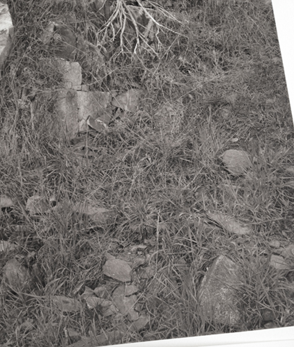
My friend Jeff Corwin and I go on photography trips fairly often, frequently visit this spot, and have both done a variety of images there over the years. The place is amazing geologically, as well as providing several lovely little escape nooks and crannies. I hesitate to say exactly where it is, because it is overrun with rock climbers, who tend to treat it as a gym, go woo hoo a lot, and leave their waste behind every boulder. Many places on this earth need far less attention. There is a year round stream in a little spot I’ve been back to many times, it’s a bit of a scramble to get down to it with large format gear.
These snaps and vids are not great but may give an indication of the place. They were made during various visits before the final image was made and were not done thinking of this write-up so are less than perfectly descriptive.
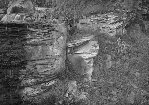
The stream meanders a bit –
then drops down around little shelf of about five feet.
How dark or light the basalt and white deposits are depends on time of year and water volume. Though it is a little location with some interesting features, I never succeeded in finding an image, but it’s a nice little spot to hang. The little waterfall, the greenery, dramatic view above, interesting basalt blackened by water, luminous white deposits. There’s a perfect little bit of sage that seemed to have grown downward, and a sculpted form of beautiful rock that looks like it was chiseled or ground to shape. Yet I found no photograph to make with repeated visits.

© Tyler Boley

© Tyler Boley

© Tyler Boley
In spring of 2015 we stopped by yet again. My phone has become a great tool almost like some used to use polaroid. Setting up the 5×7 just to see if there are possibilities gets old after several attempts a day with no results. I scrambled down to the spot again, and things just fell into place in a somewhat off the wall way.. the recent weather and water level left a distinct wet/dry – dark/light arrangement that was interesting to me, the waterfall itself compelling in that it’s NOT the center of attention and it’s presence barely suggested, the sculpted form dry with beautiful white and gray tones shining like carved aluminum, deep black of the wet rock with trickling water, detail within, it’s shape forming the left edge, soft green grass, the little upside down sage, small rock arrangements all around, the overall sweep of the rock layering from upper right expanding downward to the left dark wet shape.. ok, too much blabla… it all seemed to have a whole, a gesture, with a lot of “content”, became a thing, to me, almost a vision, yet totally real. Almost like a small segment of a zen garden, impeccably designed.
I made a phone snap at the spot where things seemed to fall together, just one, marked the spot in the dirt where I was standing, and scrambled back up to the car.

© Tyler boley
Back in the comfort and shade of the car, opening the pic on my phone and converting it to black and white and was immediately encouraging.

© Tyler Boley
Without overthinking anything I took my gear down to the spot, set up, and exposed a sheet of film. There’s nothing remarkable about that process to report, I tend to set up and work fast, not letting that process distract me from holding the excitement of the possibilities in my imagination. The upside-down and backwards image on the ground glass reinforced my initial instincts, I didn’t mull it over or move the camera around and get distracted by “what-ifs”. Jeff snuck a pic of me working to irritate me later, yet another coincidence to have content surrounding this image.

© Jeff Corwin
I warned you this would be long.
Making the print was an on and off process of several months. I like the image a lot, I wanted the print to be right. Ink prints on matte fine art paper that are primarily grays have to sit just right, or they fall apart, or look flat. Sometimes you have to live with proofs before you see what it needs, or realize what you are doing. I made a drum scan of the neg and began various edits in photoshop. Prints like this need to be evaluated on paper, whether or not it sits just right can’t be determined on the monitor. There are many versions that would be just fine on the monitor, even “correct”, and subsequently on paper as well. Yet that last 1% of effort, that can’t be forced, is what might make the difference and something comes alive on the paper. Even then, it’s a subjective response. It could all be some neurotic “make work” program…
I like finals from my 5x7s at about 14.1 x 20 on a 17 x 22 sheet. I print larger as well, but this size is really my favorite. I make a lot of proofs, at the very beginning quite small to see if I’m in the ball park, then the majority about letter size. I have several ink hue blends I work with from Jon Cone’s Piezography ink sets, using tools in my RIP to combine and blend in different subtle ways to effect hue. Why is this important?
Many years ago a somewhat disagreeable guy named Fred Picker was a force in large format photography. He wrote a zone system book, his company provided great field cameras, print washers, enlargers, etc… In one of his newsletters he describes a day of assisting master Paul Caponigro in the darkroom. At Paul’s instruction they started with one negative and made small prints with any and every paper, paper developer, and toning combination he thought had potential. It’s not that he did not know what he wanted, nor that he did not know his materials and process thoroughly. What he does know is that last difference between a great print and an extraordinary print might not be known until seen. Once that decision was made, they proceeded with size, crop, tonality, dodging and burning etc etc.. Many great printers used just one paper/chemicals combination, eliminating variables and learning exactly how to exploit it’s potential, simply a different way of working, suited to some more than others.
Though a subtle variety of hues, blends, and splits or variations throughout the scale are possible, I can’t know which ink setup may be best for a given image without seeing it on paper with that image. Years of using the setup, I know which ink combinations are not worth trying with an mage, so I don’t need to test them all. A subtle image like this will look garish or gimmicky with a hard hue split, or even a subtle one in the wrong part of the scale. Or it may look best with no obvious variations at all, a uniform hue from highlighted to shadows.
So as tonality, lightness, darkness, contrast, dodging and burning are worked out, I make those test prints each time on a different ink setup. Tonal decisions are being made as well as eliminating ink setup possibilities with small letter size test prints.

© Tyler Boley
When it seems like things are getting close, I start making proofs at my final size on affordable paper. I was down to two ink setups and minor tweaks. Also, I try different sharpening amounts with these tests, sharpening for printing has to be determined on paper, there is no short cut on the monitor.

© Tyler Boley
There are several interpretations for any image, one of the most basic is the overall “gamma” or heaviness of the image, given highlights and shadows more or less placed. Similar to moving the middle slider around in the Photoshop Levels control. More obvious moves result in high key, low key, or fairly straightforward looks. I prefer a look that is not overly “stylized” that has a strong connection to, and evocation of, reality. Still, that leaves considerable wiggle room. I find a given image, with a given inkset and paper, may have some subjective sweet spots. Again it has to be seen on paper, what might seem like a slight move could turn a fairly normal but unremarkable print into something with a presence difficult to intentionally manipulate into being.
There is another important consideration involving this, black and white prints are, to me, abstract works. There is an image that is the literal depiction of the real world, and there is a purely tonal abstract composition in a symbiotic relationship with the literal depiction, which among other things, forms the whole of the piece. One might easily consider this when looking at a black and white photograph by blurring your eyes enough to lose the literal depiction, leaving a soft image of tones and gradations, an abstract composition. For some of us still working with view cameras, that the image appears upside down and backwards on the ground glass while we are composing, a slight removal from the real scene, aides in considering the underlying abstract qualities of the scene.
The simplest way of considering this aspect in terms of printing is to reduce it to a rough composition of the highlights, mid tones, and shadows. These three simple abstract compositions are derived from three versions of this image with the mid tones darker, unchanged, and lighter.

© Tyler Boley
To me, they form very different compositions with differing gestural qualities and feel, that may contribute to, or take from, the feel of the literal image. Sometimes this exercise is helpful to actually go through, mostly it’s just something one is aware of when looking at proofs and making decisions. The tonal composition changes with editing for the literal composition, including dodging and burning, which in this case was primarily to even things out, not extensive, primarily to hit a good balance and movement within the image rectangle. There were a few remarkable little dramas here and there to exploit, for example the nice little rock sculptural arrangement below left of the central rock formation. Overall contrast is another subjective choice, many tend to work with more contrast than I, using controls to bring back shadows and highlights potentially lost. Once again viewing the above abstracts, it’s obvious the center composition would be entirely different with more contrast, the left dark shape would no longer be the predominant dark area setting off the rest of the image, nor the center white shape the dominant highlight, resulting in a more complex and certainly different tonal composition, one diverting from my original attraction. Again, these are subjective choices, and over the years become somewhat instinctual.
Working with ink on matt papers and images with subtle gradations, areas of low contrast middle tones can sometimes seem pressed together tonally and look flat. I had this problem in the lower right quadrant of green grass and gray rocks, or thought I did.
© Tyler Boley
Adding too much contrast to areas like this quickly moves the feel away from photographic, making it look “worked”. Too flat and it may border on looking posterized. Of course a printing system that carefully and precisely describes these slight variations is vital. Areas like this are also potentially enhanced or destroyed with sharpening, too much can quickly turn those myriad subtle close grays into a few tones with harsh edges, ruining roundness and dimensionality. This, again, can only be evaluated on paper, at size. Often small tests of a problem area at enlargement ratio, with different sharpening amounts, are a good way to work this out. It should also be obvious this is the largest area on the print comprised of mostly middle grays, as seen, again, in the above abstract tonal reduction. Where, tonally, these areas “sit” can effect how much presence they have, and therefore the gamma consideration mentioned above effects this greatly. Ultimately, added contrast was taken back out (an adjustment layer), sharpening was minimal to none, carefully applied, and where the mids sat made the most difference. Also these kinds of areas can easily become stylized, too light approaches a fake infrared look, too dark, over dramatized, losing the soft daylight presence of the grass and gray rocks. There is global contrast throughout the print to offset this lower contrast area and help give it presence.
After all the above and more was worked though, what anyone would hope would be a final is made on the real paper, in this case Hahnemuhle Museum Etching. It was fine, if perhaps missing the last 1%, but I wasn’t sure why or what to change. Having the luxury of no immediate need for completion, I slipped it in a beat up old matt and leaned it against the wall to live with a while, often what it takes for me. Over time it just seemed like the image wasn’t quite “there” on the paper, I made a simple move and rashly just made another final, there is was, it only needed to be very slightly darker.
final file © Tyler Boley
Clearly this is a lot of indulgence, a lot of time, energy, ink and paper. But I had no time limitation, I had an image I liked and wanted to print well, in fact I would say the success of this image is dependent on an effective print. I enjoy the work and the considerations along the way, even if no one can perceive the slight changes, perhaps even me over time.
Most images come together faster. Images that are barely there, barely “of anything”, very subtle tonally, tend to be the hardest if they don’t fall together quickly, they really have to sit in the right spot which is sometimes hard to find, the monitor image only helpful to a point. The tools we have today seem to beg to be used, and we often go right to them unnecessarily, blind to what the image is telling us.
This post is very much for myself, something I wanted to do for some time, encouraged by lot of coincidental supporting material, about a recent image and a resulting print I remain pleased with. It was interesting gathering my thoughts to present here, looking at my own processes and considerations. While very specific to this print, perhaps some of the issues and considerations will resonate with others and at least present a glimpse of what one might go through in the making of a photograph. Like they say, it’s complicated.

© Tyler Boley
The final was part of a small exhibit of my work at Google in Kirkland, WA I was pleased to include. It’s one example of our evolution should we remain curious, I would not have “seen” this, at this place, or the possibilities as a finished print, without the previous years of effort.


Being neither a photographer nor a printer, I don’t understand a lot of what you’ve written but viscerally feel the excitement you must have experienced during this journey of discovery and realization. I especially appreciated your comments about b//w photos being abstractions: “there is a purely tonal abstract composition in a symbiotic relationship with the literal depiction, which among other things, forms the whole of the piece. ” THAT is what I so value in your prints – not the actual thing photographed but your artistry in exposing the … what? The “there” that isn’t there in reality, the “there” that you create by so excruciatingly exploring the image and its possibilities. Not sure if it’s an apt comparison, but Wallace Stevens’ snowman comes to mind – you see “nothing that is not there and the nothing that is.” Oh, to have your eyes!