Hahnemühle Hemp and Agave papers
01.30.2020
Let me first stress that any attempt to display the subtleties of prints on line is a foolish, but I’ve included several anyway. Call it eye candy. My friend Bill Kennedy alerted me to two new additions to Hahnemühle’s natural line of papers made from sustainable natural fibers, explained better by them than me on their site. The new additions are Hamp, and Agave. Sugar Cane was one of the first papers, and I used it extensively for several artists, including two exhibitions of Daniel Beltrá’s work accompanying the prestiges The Prince’s Rainforests Project Award. Obviously it was a perfect choice, but now unavailable, Bamboo, the other offering, became a favorite for some of us, a beautiful slight warmth, nice surface, and stellar gamut and density performance. Based on some positive comments and my own interest in new materials I decided to do some set up and testing of Hemp, and Agave. I print B&W only, with a custom Piezography ink setup and StudioPrint RIP. So all observations are for this only. In my experience papers that exhibit the ability to present high ink densities in black, do so with the color inks as well, so I would expect these papers to have very good color gamut, also given they hold detail well and there is no mottle or bleed.
My setup is a “dual quad” ink set, a custom warm mix, and a custom cool mix, which I can use independently or blend, much like Piezography Pro. I picked a straight 50/50 combination for the initial setups and comparisons, which is lightly warm. I’m including Bamboo in these comparisons as it completes the line, and many of you may already be familiar with it. All three papers were carefully linearized in the RIP with this ink setup.
Dmax on these papers is great, we could only dream of this kind of performance in years past. On all three papers I reached D 1.82 – 1.84 with the newest Cone HDMK black ink. No winner or loser here. Differences of a few hundredths are pretty meaningless and don’t indicate anything about the individual papers. This is the highest dmax of any papers I’ve tested over the years, along with a few other premium papers. I would expect the newest black inks from the other manufacturers would exhibit excellent results on these papers as well.
Each paper has a slightly different base white. The LAB values are-
Hemp – 96.0, -0.5, 1.7
Agave – 96.1, -0.8, 1.6
Bamboo – 95.8, -0.3, 4.1
As expected by eye Bamboo is the warmest
For comparison, I threw in a premium rag paper, with a presumably similar ink receptor coating, Museum Etching – 96.2, -0.3, 2.6
So these new papers are right in line with other premium OBA free fine art inkjet papers. Visually, the impressions match the numbers. With the exception of Bamboo, brightness and hue are very similar, Hemp almost imperceptibly warmer than Agave, both very slightly more neutral than Museum Etching, for comparison. These papers, by my standards, seem natural and neutral, even though measurably a hair warm, but we live in a world of brighteners, so for some they might appear warmish. In a standard white matte, they appear normal. Bamboo, again, is the exception, it’s slight warmth is appealing and for warmish B&W prints, a great look, color too actually. It would be selected for work because of that quality, not in spite of it.
Base hue effects highlight tone down the scale until the hue of the ink overtakes and becomes dominant. To what effect this might have on your prints, here are the L,A,B values of middle gray on each setup-
Hemp – 59.40, 2.10, 3.54
Agave – 59.47, 2.01, 3.41
Bamboo – 59.26, 2.22, 4.10
Keep in mind this is a warmish ink setup. I would say the two new papers present middle hues close to identically, while Bamboo’s warmth has an effect into the middle tones and down to lesser effect until black. This was the subjective sense as well, Agave and Hemp so far are nearly indestinguishable, and all three perform very well. For color, accurate profiles would negate many of these differences, but Bamboo would still be a bit warmer approaching the paper base.
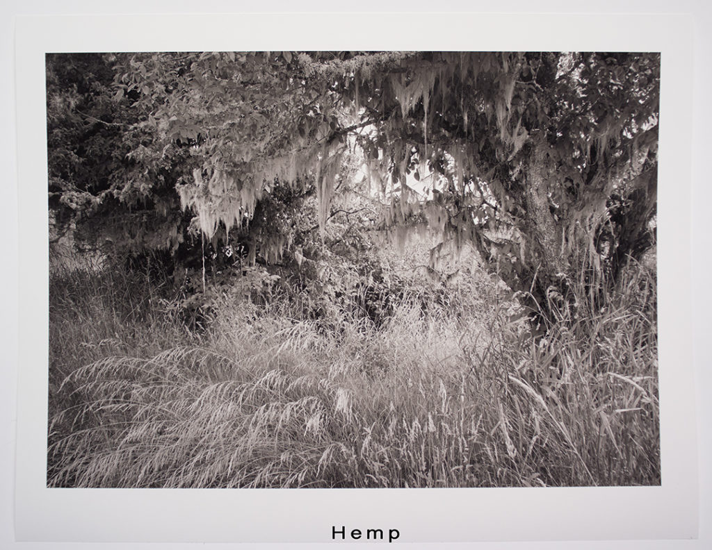
So, FWIW, here are some prints with the above ink setup-
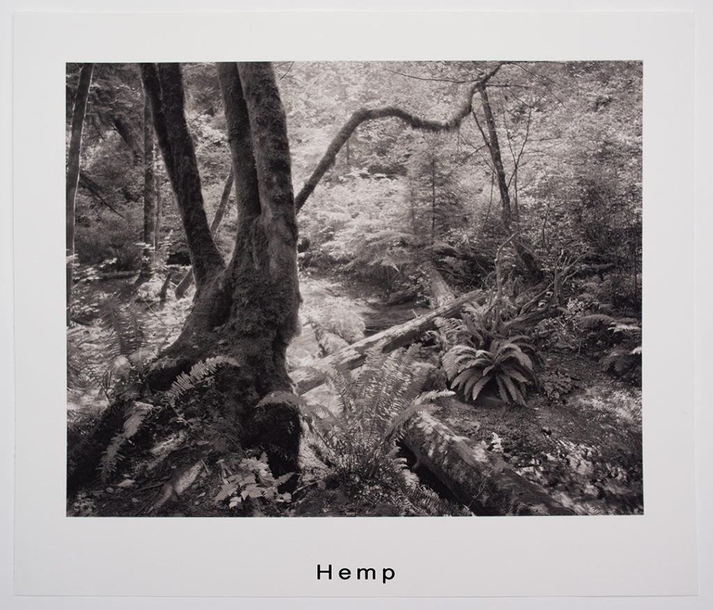
© Tylerboley
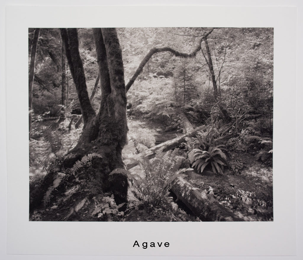
© Tyler Boley
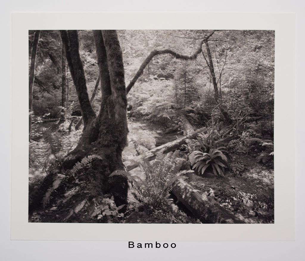
© Tyler Boley
I also made and linearized all warm ink, and all cold ink setups on both papers. Again, the differences were nearly indistinguishable and all the results were beautiful.
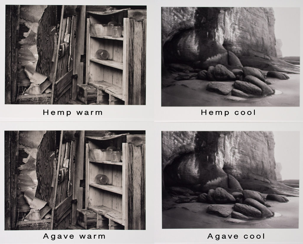
© Tyler Boley
The most notable differences between the papers is tooth and feel in the hand, These images are for comparison only, and include Museum Etching as a standard for those familiar with it. These textures are exaggerated with cross lighting, for comparisons only. Bamboo is the smoothest, followed by Hemp and Museum Etching, with Agave having the most texture.
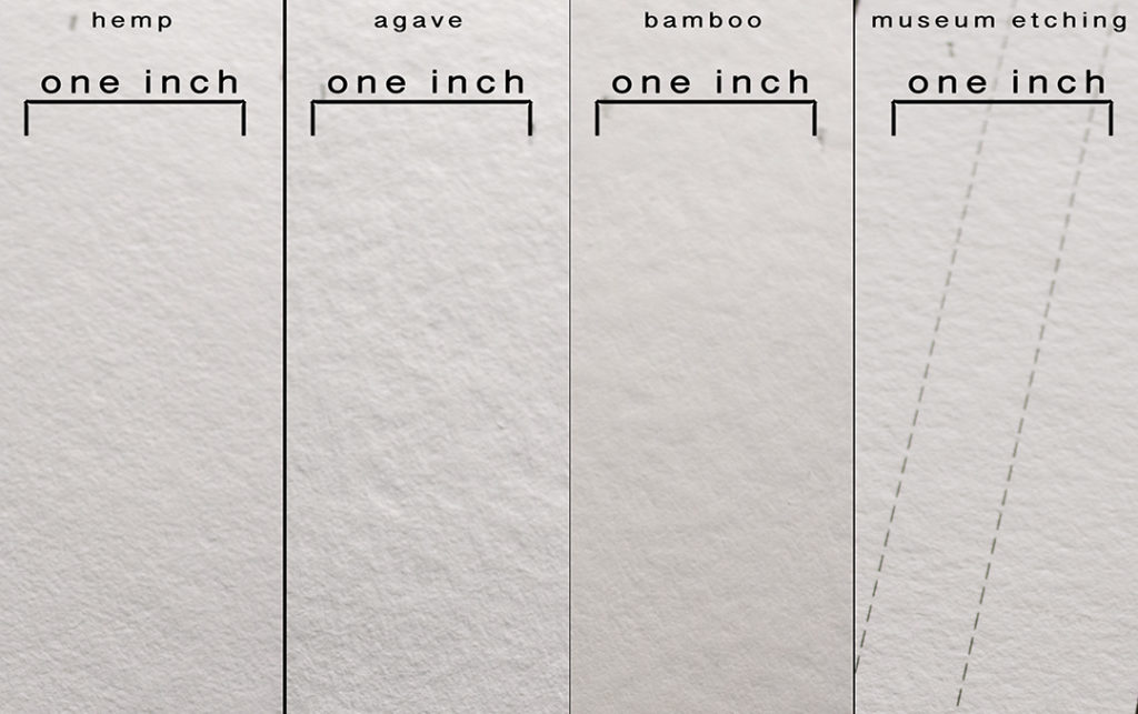
Subjectively though, at normal viewing distance (a term that never sits well) and certainly under glazing, these differences fade in significance. Agave’s look may be a more apparent factor as part of a finished piece, and a selection issue. For me, Agave is the most appealing, it’s beautiful, even sumptuous, with a natural tooth, and a appealing soft feel in the hand, it’s also the thickest of the three. But then I’ve never had a predilection for smooth surfaces, I like paper being part of the piece. Again, the larger the print, the less these factors play a role. There is a misconception that a substrate with texture will effect the sharpness of the printed image. Not so, with these coatings, every dot is precisely placed and represented,
Interestingly, despite the exotic nature of the materials in use here, the resulting papers are pretty normal! Assuming of course, premium Hahnemühle papers performing this well are “normal”. I’d conclude that selecting these papers will be based on interest in alternate and sustainable materials for your work. I love Museum Etching, and William Turner for my personal work, so I will be playing with Agave for a while to see how it will fit in for me.
I like a more complex, but subtle, hue combination for much of my own work, so I did an ink setup for Agave and Hemp, one I use on other papers, and made a 17×22 on each to live with. Again, FWIW, here are some images of those prints. It’s a tough choice, both of these papers are great, the prints all I could expect and more on any paper. Given the crisis we face on this Earth, attention to the development and availability of viable options in our materials choices has to be applauded.
© Tyler Boley

© Tyler Boley


Thank you for that Tyler. I’ll certainly give Agave a try and also the slight extra warmth of the bamboo appeals too for certain images.