More on Uncoated- looking at papers
11.01.2022
A continuation of posts regarding inkjet printing on uncoated papers, begun here- Why Uncoated Papers? for print nerds
On the Piezography forum, Walker Blackwell of Cone Editions remarked on “the very WIDE array of papers that are uncoated out there” in a discussion of the potential opportunities moving onto this area may offer printmakers. We have so many amazing papers from Japan, Europe and elsewhere, a legacy of mills creating papers for watercolor, lithography, letterpress, intaglio, screen printing, relief printing, linocut, collotype, drawing, you name it, literally for centuries.
Many will require a lot of tweaking to work with inkjet, and most won’t work at all. Evaluating all the possibilities out there would be a monumental task.
My paper criteria are pretty specific, which eliminates the vast majority, so this is a small overview.
I want a clean photographic look, as white as possible, no surface qualities that intrude into the image presentation much. Hot press papers look too card-like to me, they’re out, and I prefer a sheet size that suits my work with real deckled edges. Obviously acid free, hopefully 100% cotton rag, mould made.
In keeping with the objective of maximizing print longevity, I excluded papers that were optically brightened. Some notable points from Aardenburg Imaging & Archives- “The widely held assumption that modern media containing optical brighteners merely revert to their “natural color” as the OBAs fade is demonstrably false! Additional yellowing over time becomes easily noticeable.… …No occurrence of LILIS (Light Induced Low-Intensity Staining) has been observed with OBA‑free media!…” …from the highly informative article published here- Tracking ILIS
I also elliminated any unsized papers, and they are in the majority. Years of playing around with this stuff, unsized never took inkjet ink from a printer well, or required so much limiting etc. that the visual results were not consistent with a density range appropriate for my work.
The selected papers resulted from a lot of googling, recommendations from others, and past experience. I want to emphasize that there are many gorgeous papers that may work very well with qualities that contribute to unique works, but I found no more that fit the narrow criteria above.
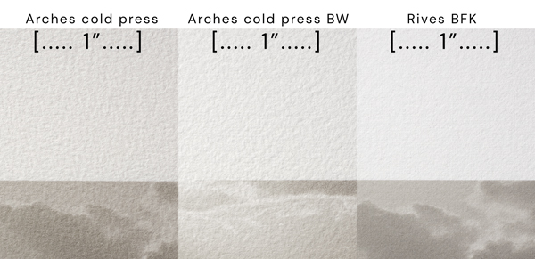
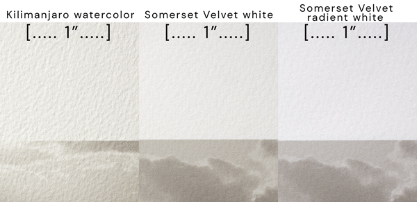
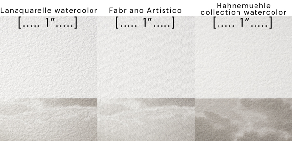
These surface comparisons were made with an off axis hard light to emphasize the textural qualities. In normal light they are more subtle.


Some consistencies amongst the tests- The nature of the sizing, how soft the paper feels in the hand and the hardness of the surface texture, all effect dmax and an image quality I’ll temporarily call dottiness, discussed later. Tests were printed with Studioprint RIP, at 1440×1440, using the previously mentioned Cone HDMK black ink, in a custom carbon K7 ink set.
The papers, observations, and dmax results (dottiness is relative to the other papers here)-

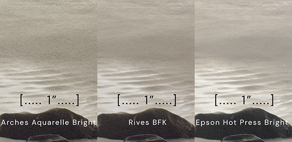
The highest dmax papers also tended to be the heaviest sized, also the “hardest”, and dottiest. Coated inkjet papers receive and accurately reproduce extremely small ink dots, conventional paper sizings don’t behave so perfectly and never needed to, or the coatings would never have been developed in the first place. There is a texture to the ink on these papers I’m calling dottiness. It could be any number of factors, some swelling of the placed dots, some near microscopic puddling of the dots on the sizing, something about the surfaces, someone smarter than I can get to the bottom of that. Conventional wisdom was that given enough ink limiting, dot spread, mottling, bleeding, could be brought into line. But I’ve found there seems to be a point of no improvement, and it’s still short of the precise ink dot reproduction from coated papers. Printer resolutions of 1400×1400, 2800×1400, and 2800×2800 and various viable limiting settings made no difference in this regard. With a multi K inkset, dottiness would be expected from excessive limiting, as the darker inks, and K, would move farther up the scale but this seems unrelated. Performance per paper is as described above, I’ll show 3 examples, one of the worst, one of the best, and a coated inkjet paper for comparison, all made with a K7 Piezography ink set.
 This is not insignificant, I love the amazing smooth, artifact free, continuous tone of high resolution inkjet on beautiful paper, particularly with multiple density inksets. These methods on these materials will require a compromise in that regard, in the meantime I’ve narrowed the papers down to BFK, Somerset, and Stonehenge, the next steps and seeing some prints should help make a final selection for my work. I’ll get into that decision making, the printing methods attempted, and some work to see for the final post when more work is done.
So another deep dive down a rabbit hole. I realize none of this is relevant to more than a very few people, someone may find a glimmer of info in here that helps their work.


You may possibly get a smoother bring with extreme limiting of the inks starting in the mid-shadows through the highlights. This is what I did when building the uncoated Pro QTR curves (published in the community edition). Conversely, a dedicated matte-only ink-set using the “powdery” nature of the UltraHD carbon for the lighter inks may reduce spread and thus reduce dottiness in uncoated . . . cheers -Walker
Yes I have more things to try now that the paper selection is narrowed down, including where and how much limiting takes place. I’ll certainly try that and more, thank you. The look is not a deal killer by any means, test prints so far are very nice, just a bit if a slightly different animal, but this has been the case all along
Thank you, Tyler!
👍🏻
Thanks for doing this Tyler, I know it’s a lot of work. And yes, it’s very interesting for us print nerds.
This is all fascinating to me, Tyler. I admire your detailed approach, the precise methods, as well as the superb printed results.