Hahnemuhle Museum Etching B&W setup and evaluation- A long one
08.10.2014
Since going through this process throws light on several issues, some perhaps peripheral, but important, I decided to post the process. Everything from why it was required, through execution and completion may be applicable to others in a variety of situations. When I first started inkjet printing there were no good coated fine art papers at all. Iris prints had sparked our imaginations, and affordable desktop Epsons raised our hopes. The only papers that seemed to be able to take the ink were some heavily sized papers from Arches, and the mainstay of the times, Somerset Velvet Radiant Fine Art, all still beautiful papers. They could take very little ink, were far from accurate with any driver setting, which threw us into the world of profiling, and when under control still have small gamuts and low maximum densities. Suddenly Luminos, Media Street, and several others came out with coated fine art papers that took ink remarkably well, and we were off and running. All of them seemed the same, I was using a lot of Lysonic Fine Art, which seemed identical to papers from the others with different names. Then, the Hahnemuhle brand appeared, and we all learned they were making these beautiful papers, and others were rebranding them. This 400 year old company has been making some of the finest art papers in the world, but as photographers they were new to us. It turned out my Lysonic Fine Art was Hahnemuhle German Etching. What remains remarkable to me is that Hahnemuhle’s earliest offerings back then, their fine art papers for which they had developed ink receptor coatings to prevent wicking, hold ink dots tight and sharp, handle high ink loads, and present the ink with remarkable densities and gamuts, those very first coated papers.. few have met or exceeded that performance in all this time. Many wonderful papers have come out under a variety of brands, and are viable choices for a variety of needs, but Hahnemuhle remains among the best for fine art matte density and gamut performance.
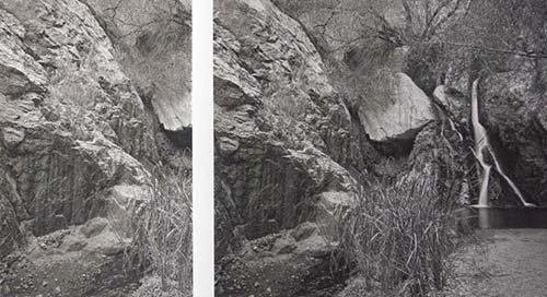
The print on the left is on a wonderful paper that performs really well, I use it sometimes and also print on it for others, on the right is Hahnemuhle Museum Etching. Either print could be made to look much like the other by lightening or darkening curves, but the extended dmax of Museum Etching allows detail and separation all the way down into densities that would block up on the other paper. Both papers are linearized. Another factor many don’t realize is that there is a reaction between these inkjet receptor coatings, and monochromatic inks, that affects the hue of the image. Most would naturally assume that a warmer paper base is going to result in a warmer print, inks etc. being equal. Other than in the lightest of tones that reveal the paper base hue, this is not necessarily true. For example, The Epson Signature series of fine art papers have excellent dmax and gamut, interestingly the coating presents monochromatic inksets (primarily but not always 100% carbon) cooler than many other coatings. An identical print using a warm inkset to best show this, one on Epson Hot Press Natural, the other on Canson Rag Photographique, displays this easily. I used exactly these samples to show students. Both papers are smooth, both cotton rag, the only obvious difference is that Hot Press Natural is warmer than Rag Photographique. And yet the prints are the opposite, both warmish, but the Espon’s coating chemistry cooled the ink image set so that it is actually visibly less warm than the print on Rag Photographique, even though the plain paper borders around the image show the opposite, the Epson clearly warmer. I mention this because it becomes an issue for us monochromatic ink B&W artists, we’re after something we respond to, not only in densities and paper surfaces, but the subtle hues of the image, just as we did with silver paper selection, paper developer and print toner use. So coating/ink interaction becomes a factor, often unwittingly. The reason you won’t see this if you use a normal color workflow, with normal color inksets, is that good color profiles for each paper will put whatever ink is necessary on that paper to represent the hue called for in the image. The example above.. say, might have more of the cool color inks applied to the neutrals for the Canson paper than for the Epson, because the core inks in neutral hues are the black and light black inks, and they are largely carbon just as the monochromatic ink sets are. The Epson ABW driver, though, may show this as it’s not color managed, the ink recipe is determined by settings with no alteration from profile conversions. I recently saw this while assisting someone with a calibrated ABW workflow (not as easy as it sounds) and a Canson paper image was considerably warmer than an Epson Hot Press Natural image with the same hue settings in the driver… back to my paper setup…
Many photographers were immediately taken with Hahnemuhle Photo Rag when these papers appeared, it was relatively smooth, and a clean white. But I was really drawn to German Etching, a beautiful subtle tooth and a very slightly warm base hue resulted in photographic prints I liked even more than alternative process prints. But our old Epson 3000s would not pass it through without skewing. Another Hahnemuhle mold made paper called William Turner came out with the same coating and performance, and was available in a thin version that our 3000s could accurately advance, and things fell into place. William Turner’s tooth was a bit “hard”, and more apparent than German Etching, but the prints were beautiful. I had used the one and only mono quadtone set made back then, by MIS, then moved to Lyson dye quads, then Jon Cone’s Piezography inks. At the same time larger and more robust Epson models came along that passed the thicker William Turner with ease. I toyed with both German Etching and William Turner for some time, prefering The German Etching surface, just as a paper. But at some point you have to let go of little things and just experience the print. There’s something about William Turner, perhaps BECAUSE of that texture, that is just extremely rich, maybe like the deep cloth in a black velvet Elvis painting, it’s a subtle difference, but it’s there, and the texture is not really an issue. Also, William Turner is 100% Rag and contains no optical brighteners, as opposed to German Etching, so there’s a slight snob factor involved as well. To refer back to the coating/hue issue, there is a certain richness to the hues resulting from Cone inks on Hahnemuhle’s coatings, that is very subtle, but I’ve come to expect it and manipulate it for my personal work. The subtle hue differences available from the various Piezography ink sets seem richer to my eye then other fine papers, sort of a synergy. This carried forward when the Piezography K7 ink sets replaced the Piezotones. Again this is something that is hard to detect, and prints with the same inks on other wonderful papers will look great, it’s only side by side that I always pick William Turner, even if I might prefer some other surfaces.
Surface delicacy is a major issue with coated fine art papers. Initially this was bothersome because photographer’s materials were historically pretty robust, we weren’t used to handling issues. But since ink on these surfaces has moved beyond just viable, and results in such excellent art, I’ve come to accept this as part of the territory. Many kinds of art on paper require care, imagine being a charcoal artist. William Turner, having the coarsest surface I’ve dealt with, is particularly prone to surface flaking, which I deal with by prebrushing, careful handling, proper storage and framing. Recently I decided I need some sets of my work for demonstration and presentation purposes, easily taken in and out of cases, and handled a fair amount by myself and others. William Turner is not going to work for this, nor is German Etching. Hahnemuhle makes another 100% cotton mould-made paper called Museum Etching. A good description of “mould-made” is here on the Canson site. Without getting intro paper making issues, there are other kinds of fine art cotton papers made other ways, requiring whatever desired surface quality to be manufactured in, resulting in a pattern-like mechanical looking texture, as opposed to the natural look of mould-made papers.

This is a manufactured surface texture, a non mould-made 100% cotton fine art inkjet paper.
 These are the three Hahnemuhle papers discussed here, all mould-made. German Etching has the more subtle tooth, Museum Etching a “larger” texture, but not coarse, and William Turner the most obvious. A side note about surface, many ask if a textured paper will make their images less sharp. In fact, not really, sharpness is largely determined by the ability of the coating to hold a sharp dot and higher ink percentages. Ink will not scatter when it hits these surfaces, the coatings hold the dots where they are precisely placed by the nozzles. Of course, visually, surface texture contributes to some degree, but it’s worth noting I make large format negatives, drum scan, and tend to favor extremely fine detail, William Turner’s surface has never detracted from that detail or been an issue of any kind.
This new set of prints presented a dilemma, because of the intended viewers, they had to be the best I could do, and represent my best efforts accurately. There are many papers that would handle with fewer problems, but would not show my work as intended, all a compromise from my William Turner prints. When discussing this problem with my friend Lauren Henkin, she mentioned she had completed some book work with Museum Etching and it was holding up well. I was somewhat familiar with it, but assumed since it was also mould-made with probably the same coating characteristics it was probably also delicate. But also, for those very reasons, probably took ink very much like German Etching and William Turner. I asked Carol Boss at Hahnemuhle USA if she thought Museum Etching was indeed a more robust surface. Carol has come through for me time and time again over the years. She agreed with Lauren and made sure I got enough of it to do in depth tests and evaluations. Before testing, just seeing and holding the paper, it is a beautiful paper, very sumptuous, thick, with a very natural surface.
I often see comments on various forums that one paper or another has better contrast, or prints too dark, or is too warm, better shadow detail, etc. etc.. In my experience, unless the paper is considerably outside the norm, what is described is usually the workflow and profile, not the paper itself. The single biggest factor in how a material presents ink is: the profile and it’s use for color prints; and linearization/ limiting for monochromatic ink prints. For evaluating 2 papers with the same image.. if RIP or driver media settings have not been determined optimal for each paper, and then identical profiling practices used for each, with those settings, you are not seeing what each paper is capable of, and how any differences in performance delineate themselves. Often those differences nearly disappear, but gamut, surface qualities, base hue, etc. can appropriately come to the forefront for comparison.
For my B&W work I’ve developed ways of using different combinations of Jon’s Piezography ink sets to subtly control hue in different parts of the scale. I select that “blend” on an image by image basis to my own satisfaction, this is an important part of my process even if apparent only to me. As discussed above, the way Hahnemuhle’s coating brings out and delineates those hues is very important and must carry though in this new portfolio. So to conclude evaluation of Museum Etching, I need to linearize, from scratch, some of those same ink setups used for some particular comparison images, and maximize the paper/ink performance, before comparing any prints.
This takes more time and paper than one might imagine. With the Ergosoft RIP Linearization charts of 80 patches are printed out with no curve pre-applied, unlimited, to find the potential dmax. After curing over night, they are measured back into the RIP, if the highest density is too soon, and the ink curve shoulders over, the RIP will require that I limit and print again, if not, I can move forward. For those requiring a pre-limit, this chart is printed again. At this point charts are printed again and again, each time the measurement is closer to linear, so we’re fine tuning. My dmax numbers for the different setups are coming in at 1.7 to 1.72, excellent, and in line with my William Turner setups. Blacks and deep shadows will appear the same in depth.
This is done at least four times for each ink setup, each time the charts sit over night for the densities and hues to settle in to what a final print will look like. Only now can I begin to make some prints.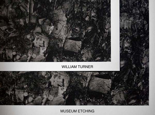
This is here for illustration really, not lit evenly or anything, there’s no way this jpeg on a monitor can illustrate the kinds of comparisons I need to explore. But this is what I need to do. This is one ink setup, and one image that uses particular parts of the scale and particular degrees of contrast, made most effective to me partially by use of subtly different ink hues shifting throughout the scale. Different images have different ink setups I rely on to help bring them to life on paper. So far, Museum Etching is looking great, and nearly indistinguishable from William Turner, other than surface texture, which is pretty similar. My hues seem to be revealed, which was 80% expected because the coating is probably the same, and the dmax visually identical, the darks have the same impact on each. I might still give the nod to William Turner, but I think it’s lighting dependent, and due to that surface, when inked, just not reflecting anything back at all. But most importantly, the prints “feel” the same.
My job now is to make many more prints using the different ink setups, high key, low key, prints with soft mid tone presence, etc.. to confirm my intentions for the prints as objects are coming through. Also, I will leave all these tests, and prints, laying around while I work, piling and repiling them, shuffling them, with little care, and see how the surfaces hold up over time. So far so good, lovely paper, and probably a solution to a long time dilemma. Thank you John Dean, for showing me this paper years ago so that it would nag in the back of my mind all this time, Lauren Henkin for nagging in general, and Carol Boss for constantly supporting our obsessions.
Though very specific in intention, I hope some of the issues brought up in this process are of interest.


It is so nice to know I am not the only one who goes through extended testing to get the best print possible, and it even sounds like we use a near exact setup. Ergosoft, Cone color inks for me, and of course Hahnemuhle! I’ve been hooked on GE & WT for years and just recently got into really customizing my dithering, linearization and profiles on the rip. I have been tempted to test Museum Etching and at some point peizography inks so thanks for the write up!
Joey Sigler
Signature Image
Tyler-
I’m thinking of using Hahnemuhle Museum Etching in a hand-held portfolio and was wondering what you found out about this paper as far as it’s scuff and scratch resistance when in a portfolio. Does it hold up well?
-John
Hi John, like all coated mould made papers it needs to be treated with care, but I have found it more robust than William Turner and German Etching. I’ve decided to move forward with it for anything that might get handled.
So glad to see others bowing down to the gods of Hahnemuhle, and I appreciate the info shared. 😉
I have struggled to find an efficient way to show the work without it getting damaged. (gloves? Sleeves?). A gallerist confirmed that there is but one way: a portfolio must be martyred.
ask your gallerist how they handle charcoals… I haven’t found this that big of a problem if treated with care like other delicate art. I always use interleaves, never “shuffle” them, etc… the other option is to make a set just for showing like this, and consider it disposable if you don’t to burden others with your handling concerns
Thanks for reminding me that William Turner is OBA free, as can be demonstrated in several tested samples in the Aardenburg light fade database. I had forgotten that, thinking that Museum Etching was the only totally OBA free paper in the Hahnemuhle matte paper lineup. That said, the William Turner samples are indeed more prone to “flaking” although the flaking is not really coating loss, just loose dust on the paper surface probably accruing at the paper slitting operation and which impairs the ink from reaching the solid coating, hence brushing before printing does seem essential. Museum Etching suffers this fate much much less,does indeed seem more abrasion resistant, and it quickly became a personal favorite of mine along with its Hahnemuhle Luster companion, HN Photo Rag Pearl.
Tyler, this is great article. Thank you.
All the best,
Mark McCormick-Goodhart
Director, Aardenburg imaging & Archives
Thanks so much for visiting and commenting Marc. Your input is highly valued. Nice to know my favorites are also yours!